I remember what my kids were like at that age, going off to college and always buying stuff! If you buy a lot from Amazon, it soon makes sense.
You can cancel anytime too, so that makes it an even better offer!
Of course, I’m an amazon affiliate, so I’ll get a reward for signing you up, but it seems like a no-brainer to me if you are getting everything from amazon anyway!
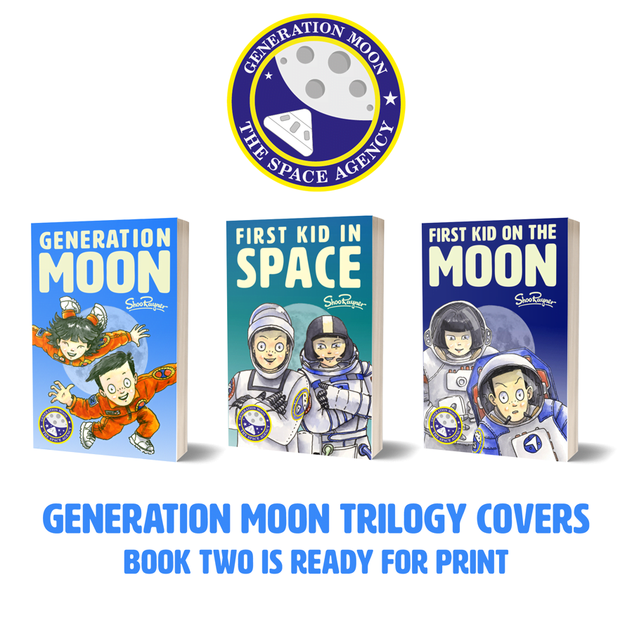
A trilogy needs a “brand” look and feel, yet each title needs to look distinct.
Book Two of Generation Moon is almost ready to send to the printers. I need images of the other books to put on the final pages and back covers of all three books.
The easy way of differentiating titles is to give them different colour backgrounds. I’ve noticed in the past that this can be a hazardous choice. When my series titles, mostly aimed at boys, were given a pink cover by my publishers, they didn’t sell, no matter how cool they might look.
Colour is a difficult choice.
I’d always intended that the Generation Moon series would be blue, starting with a sky blue in book one where the story is Earth based, ending up with a a dark, royal blue in book three which is part set on the Moon, with a middle blue for book two which is set part in Earth orbit.
The mid blue for book two didn’t look right.
I needed to stay close to blue but keep the title separate from the two blues of books one and three.
With photoshop, you can try out lots of variations easily and quickly. The mid blue. somehow looked dirty when placed between the other two covers, so I eventually chose the Aqua colour in the image above.
It’s bright and clean, keeps the branding on target and differentiates between the titles, while stepping logically, through colour, from first title to last.
What do you think?
(No, I’m not going to add stars. In my experience stars muck about with the cleanness and readability of type.)
Book two is almost ready to go off to the printers. I hope to put it to bed sometime this week, then it’s on to book three.
Life has had some funny turns during this project. I was actually convinced I was going to quit after book one. It’s been a bit of a struggle with self-discipline to get this far, but I’m back in the groove again.
I’ll release book two quietly and then put all my effort into marketing when book three comes out.